
4 Design Choices All Brands Must Make
Have you ever wondered why certain websites choose a strong use of color versus a lot of whitespace? Or maybe why some use buttons with sharp corners versus rounded ones? Unless you’re a designer, you probably haven’t put much thought into those small details that make up some of the most recognizable brands in the world. But all of those seemingly insignificant design choices were made intentionally, and serve a greater purpose: to communicate a brand’s identity to consumers. Here are four of the biggest design choices every brand has to make.
1. Whitespace vs. Color
Whitespace refers to any use of negative space (white, black, or colored) that puts emphasis on a single product or selling point. We might be able to credit this trend to Apple, one of the first brands to popularize the minimalist design aesthetic. Whitespace works well for Apple because it highlights the simplicity of their sleek and innovative products in the tech space – but it isn’t for everyone. Take McDonald’s, for example. The ubiquitous fast food company makes smart use of this ad’s negative space. From afar, the bright red color simply evokes feelings of hunger, but upon closer look, the silk-laden backdrop provides context and cleverly complements the cheeky message in the ad copy.


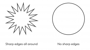
2. Sharp vs. Round Shapes
Every few years we see the switch from sharp, rigid buttons and shapes, to rounded, more organic forms – and back again. While rigid shapes pair well with flat design, round shapes complement a more three-dimensional aesthetic. Using straight lines and sharp angles in your brand’s identity can help to convey that you mean business. Rounded silhouettes, on the other hand, can give off a friendlier, more approachable vibe. According to UXMovement, rounded silhouettes also tend to be easier on the eyes. The example below shows this phenomenon clearly: Because circles contain less information for our brains to process than other more complex shapes, they are easier to look at – especially at a glance.
3. Serif vs. Sans Serif Fonts
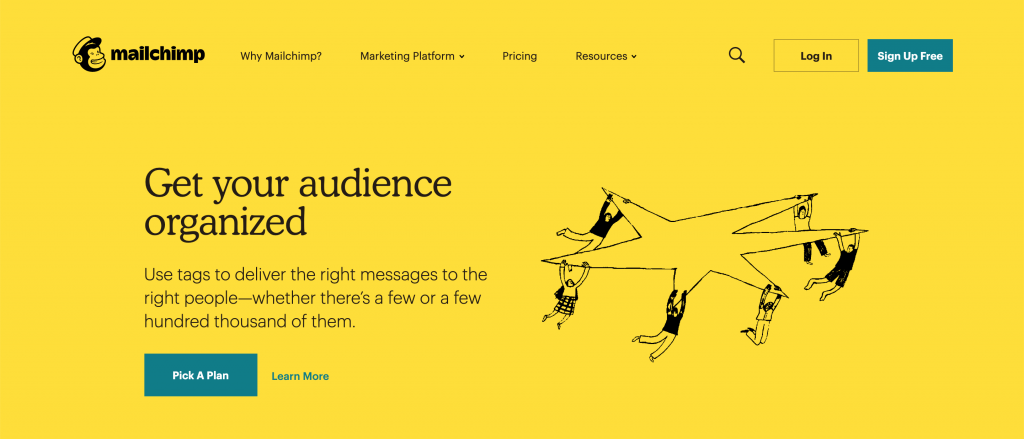
As we mentioned in a previous blog about the most popular design trends of 2019, serif fonts have officially made a comeback. That doesn’t mean sans serif fonts are out – they both have their place. Serif fonts are traditionally used in print, while sans serif fonts are easier to read on a screen. That doesn’t mean serif fonts are off-limits for digital or online businesses, however. Many brands use serif fonts strategically, incorporating them into short, bold headlines, like MailChimp has done below. This is a great example of ways brands can stay current with design trends without completely abandoning their aesthetic.
4. Commercial vs. Noncommercial Imagery
Imagery is one of the most impactful aspects that shape a brand’s identity. The choice between commercial stock photography and a more organic or editorial look can change the entire tone of a brand. If you’re not sure of the difference between the two, commercial stock photography tends to appear more staged and idealistic, usually with a smiling face, while noncommercial imagery usually has an element of realism. Take a look at the examples below to see for yourself:


In the image on the right, the blurred edge makes us feel like we are peering into a private moment that has not been staged or overproduced. The image on the left, however, is clearly staged and carefully posed. In recent years, we’ve seen brands drop typical stock photos and instead use more natural and organic photography as a way to embrace authenticity and connect with their audience.
When selecting stock photography, it’s crucial that brands find appropriate imagery that lend visual cues to their mission, voice, and tone. Here is a more in-depth analysis of the types of stock photography brands should avoid.
How can Social Fire Media help?
If you’re struggling with how to build your own brand, the branding experts at Social Fire Media can help. We offer branding services, website design and development, and custom graphic design to take your brand to the next level.


This is just amazing. Thanks…